Stop Blocks Overlapping on Different Screens on Squarespace
Something that I see on a lot of Squarespace builds is blocks overlapping when they shouldn’t.
It’s a common problem when screen sizes shrink but luckily, there is a way to rectify it.
Keep reading to find out how…
Watch the video
Check out the YouTube video below 👇
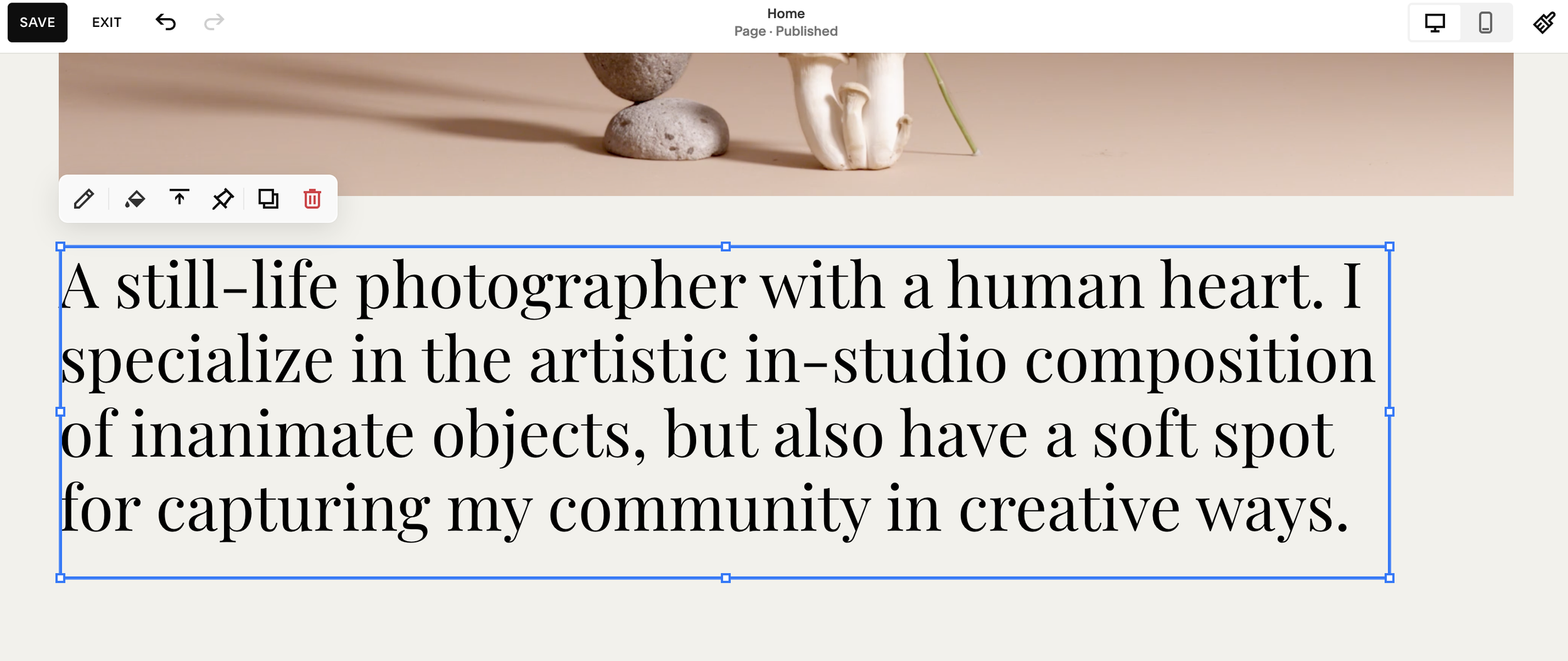
Head to the section where your blocks are positioned. To make sure that they don’t start overlapping when the screen size shrinks, you need to make sure that the blocks themselve are not overlapping.
Take a look at the blue lines that surround the block and drag and drop them so that they don’t touch or overlap the other block.

Even if the content of the blocks isn’t overlapping, you still need to make sure the blue block outline itself doesn’t overlap either.
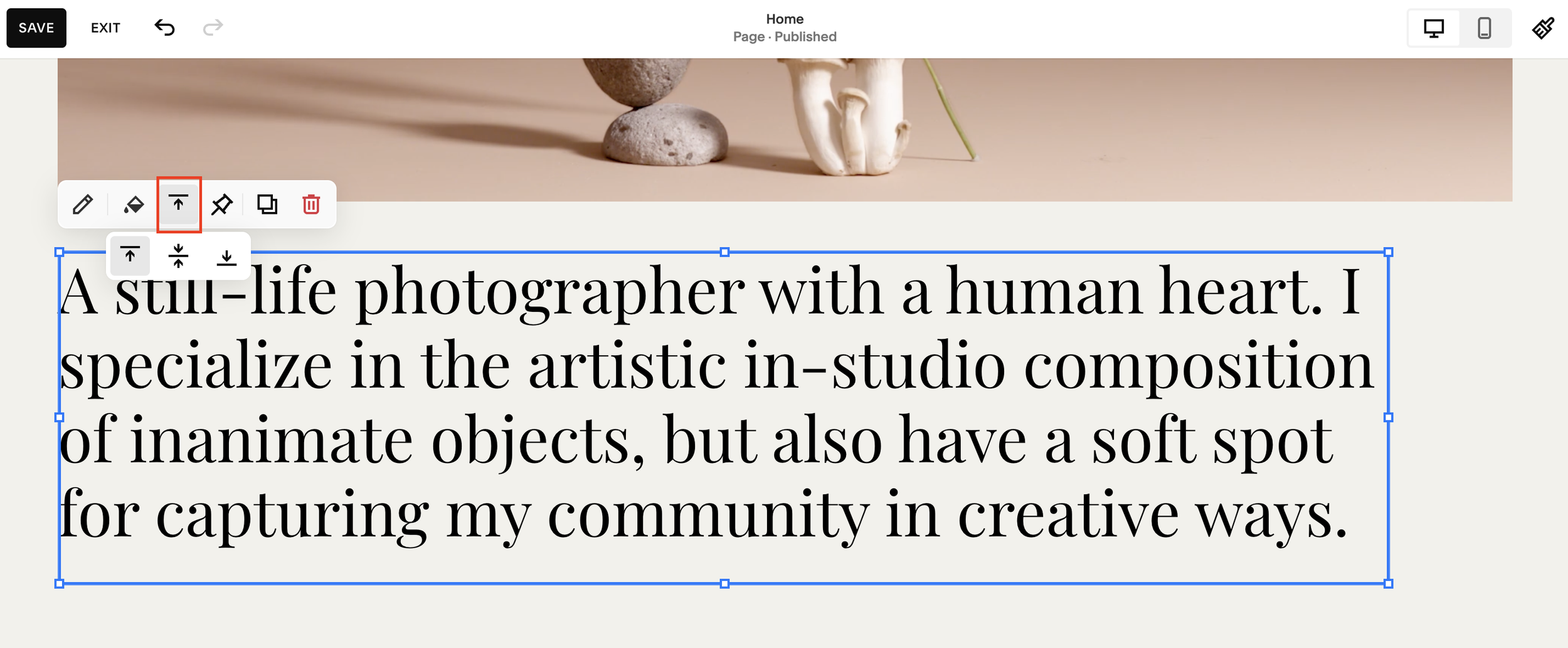
If this means your blocks aren’t as close together as you would like, you can click the vertical alignment button to bring them closer together without causing them to overlap.

📩 Join the inner circle to get exclusive code updates
This is how you should be building all of your Squarespace web pages as overlapping blocks look messy and unprofessional to visitors.
With that in mind, make sure you remember this trick for your future builds!
Your designer
I'm Sam, an award-winning Squarespace web designer. I have worked with every type of business, building platforms for solo entrepreneurs through to multi-million dollar corporations. If you want to discuss a potential project, you can email on sam@bycrawford.com or get in touch with me here. Alternatively, you can book in a free 15-minute consultation call here.
Want more?
by Crawford is led by Sam Crawford, a multi-award-winning Squarespace website designer with 700+ sites launched for clients in over 30 countries. He builds fast, mobile-friendly Squarespace 7.1 websites designed for SEO, clear structure, and conversion.
As a Squarespace Expert, Enterprise Partner, Circle Member, and community speaker, Sam is known for pushing the platform’s limits. With 200+ reviews, clients highlight by Crawford’s clarity, precision, and real-world results like higher rankings and stronger lead generation.


![Hide Any Element on Squarespace [Easy CSS]](https://images.squarespace-cdn.com/content/v1/5f53b4dad693da2d34e4e397/1745586386152-GMDCTB7KEDAVDBX58GKY/image-asset.jpeg)
![Where You Can Find Your Mailing List on Squarespace [Hidden Menu]](https://images.squarespace-cdn.com/content/v1/5f53b4dad693da2d34e4e397/1744986859218-MXSW70UQA9MSX2QASJ8H/unsplash-image-gClIPKFrRjE.jpg)


![Easily Search For Pages on Squarespace [Using Search In Pages Mode]](https://images.squarespace-cdn.com/content/v1/5f53b4dad693da2d34e4e397/1740834048635-F5NEJ01I5VC2VX24ATQA/image-asset.jpeg)

